
Logo design
I had the opportunity to redesign both of Ann Arbor, Michigan’s golf course brands. Golf course logos often look generic, so I wanted to make sure both courses had a specific icon that represented their long history.
Leslie Park’s came ultimately from the historic barn I saw on its property. The typeface is feminine and complements the course’s lush wooded landscape.
Huron Hills Golf Course was straightforward – the iconic Huron river runs straight through the course. The typeface gives a slight nod to art deco, as the course was founded in the 1920s.
I was also asked to redesign the historic Ann Arbor Farmers Market logo and materials, as it had a long history of inconsistent logo and type treatments. It is still in use nearly ten years later.
The KindleFest logo on the bottom right was a freelance job for Ann Arbor’s historic Kerrytown. This annual event is inspired by traditional German Christmas festivals and draws thousands every year.
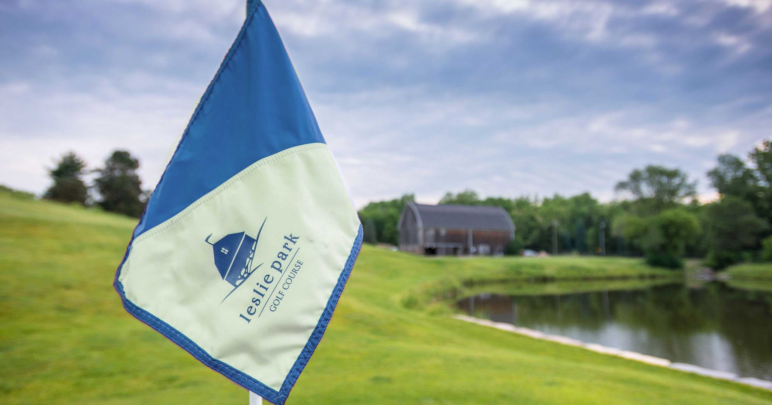
A flag on the golf course with the barn in the background.
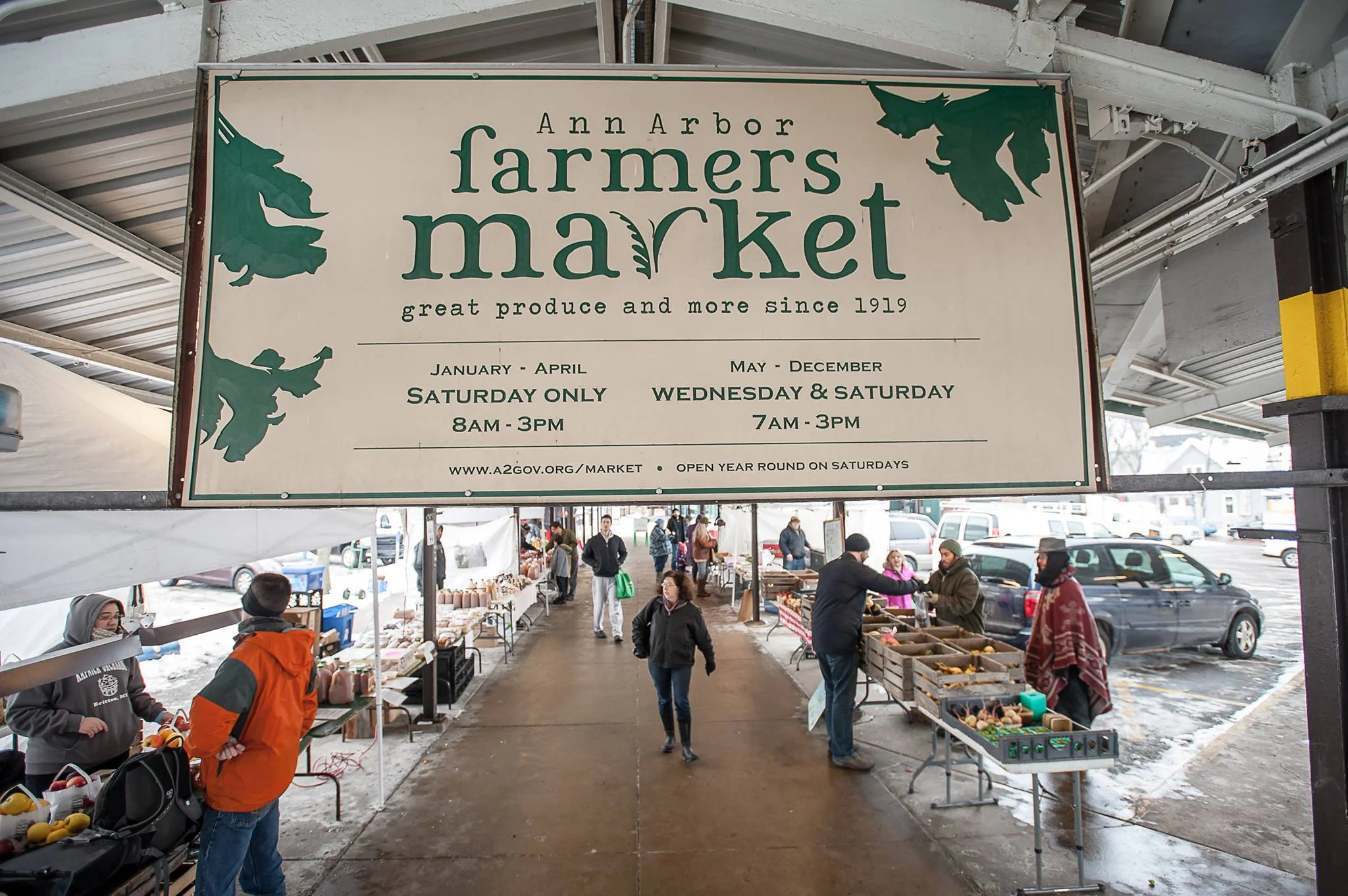
A cold day at the market.
Below are variations on a logo for BlueSky Bath. The client was starting a new line of bidets and wanted something fresh and friendly. I experimented with bubbles and their resemblance to puffy clouds on a sunny day. The last example was ultimately chosen.
Variations for the client