SCU’s Jesuit School of Theology Redesign
Its online application process and the complex navigation often led visitors on a wild goose chase, while the site’s key pages failed to reflect the warmth and diversity the school is known for.
Timeline: 1 year (simultaneously with other projects)
My Role: Principle designer, art director, secondary project manager
Team Size: Manager, Developer, Consultants, Designer (me)
Personas: See document
Research: See analytics
Challenge
Application information was buried: The school had an outdated homepage and other key pages that made it difficult for a potential student to know how to obtain application information
50+ unused or hidden pages that made finding other key information, especially for international students, a nightmare.
Key pages lacked warmth, diversity, and personality. Branding and visual design failed to show visitors to the site what an experience and community at JST would really be like.
Getting to know the users
From Google analytics and talking to staff, I gathered that JST served three main groups:
“Fred:” Staff or community of JST, who needed to primarily keep involved with events on campus, sign up for emails, and upload courses
“Jacob:” Current students, who needed to find registrar info, as well as register for classes, find aid, and quickly look at the academic calendar
“Christine:” Prospective students, who needed a clear path for admissions, quickly find faculty information, and get a feel for the school by looking through the site
Additional info:
50% of its students are minority or international students
50% of its students are women
50% are lay people
User tasks
After I had established personas, I broke down their needs and frustrations into actionable tasks.
UX goals - identified “quick wins”
With an outdated site like this, easily spanning hundreds of pages, we identified key “quick wins” to help us prioritize.
Overall - streamline site pages and architecture, removing excess accordions
Admission - simplify application process
Rename Admissions (formerly Future Students) and Financial Aid (formerly Finance Your Education) pages
Academics - list degrees and programs in a scannable format. Fix outdated Java and course description display.
Give top 5 landing pages a facelift
Goal: overall site architecture cleanup
Old sitemap
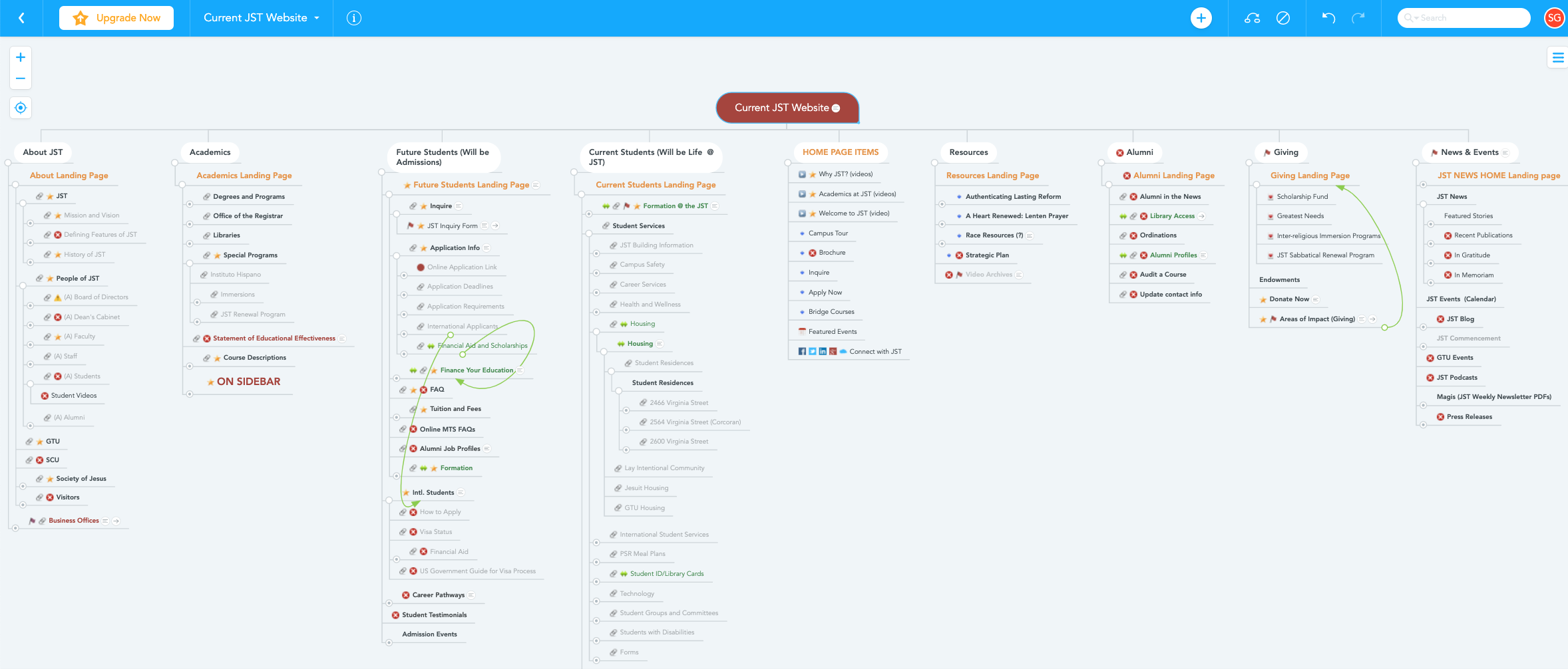
Before I could tackle any design, I had to understand the architecture of the site. I built out my own site map to help myself unravel it. It turned out to have over 50 unnecessary pages, of which only the top 2 levels are shown below.
Down the rabbit hole
How many link icons can you see on the site map section to the right?
Each represents a page that mainly consists of more accordions, which, when expanded, contain only more links to other pages, leading the user down a rabbit hole.
In some places, information appears twice.
My goal was to consolidate like information and eliminate outdated content and pages.
Main pages like Admissions ( initially named “Future Students”) consisted mainly of accordions, revealing more links instead of key information.
New sitemap
I reviewed all content and pages with the client a series of working meetings, eliminating and consolidating until we were happy with the flow and information.
The new sitemap only goes 2 levels deep, and I have eliminated excess pages and accordions.
Goal: Simplify the application process
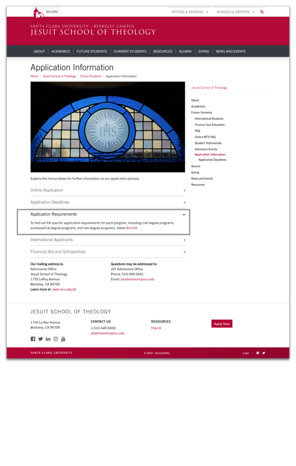
Old application checklist flow: 4 Steps
Future Students > Application Information > Application Checklists > Specific degree checklist page
New application checklist flow: 3 steps (plus a facelift!)
Intentional detail
(1) Application information appears in organized cards at the top of the newly named Admissions landing page.
(2) Application checklist landing page is organized by type and category of degree, no longer just a single bulleted list
(3) Checklists themselves have been properly coded with cascading bolded headers, special list styles, and shaded note callouts, for more accessible scanning and reading.
Goal: Academics - list Degrees and Programs in a scannable format
Old Degrees and Programs landing
This page has all degrees in a bulleted list, which, while scannable, make it visually underwhelming and not immediately clear what information a user would get by clicking.
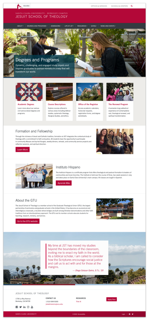
New Degrees and Programs landing
Now, information about special programs are separated from degrees in an engaging way on the landing pages, while course descriptions and degree information is easily found from one landing location.
Goal: Fix outdated Java and course description display
I updated course descriptions from an outdated java accordion system to a CMS program allowing professors to list courses in one place, and have the information populate automatically onto JST’s descriptions pages for quicker future setup and maintenance.
Old course descriptions
Old javascript made a single click expand every course description at once.
One click on any course and every course description expanded. Talk about a heavy course load!
New course descriptions
Now, course accordions automatically populate on their pages via tagging from the school’s master list. They expand one at a time in accordions. One and done!
Voila! Courses populate automatically from their single source of truth.


