

Eversight Rebrand
Eversight is a non-profit that restores sight through corneal transplantation. It also partners with charities, funds research into blinding eye conditions, and educates communities. Its brand was in desperate need of a refresh.
Timeline: 1 year (approx.)
My Role: Designer (sole designer)
Team size: Marketing lead, marketing/communications manager, designer (me), internal stakeholders
Challenge
The organization’s former name, Midwest Eye-Banks, was no longer relevant, as it had seven locations across the nation
All locations were using different logos, and names as they had been acquired over time and never updated
Its visual brand was painfully out of date, with a typeface that could not stand the test of time
Initial ideas
After much deliberation and months of research, my team settled on the name Eversight. My initial logo concepts were too far away from the organization’s heritage for our CEO, who was concerned older, extremely loyal audiences such as Lions Clubs would feel alienated.
Holy Copperplate, Batman!
The organization’s main function is preparing tissue, but because its marketing initiatives are within the communities it serves, the logo and typeface needed to look accessible and friendly, not sterile.
Eversight’s new logo and subsidiary lockups
Based on the CEO’s feedback, our team took a step back and I did a redesign of the existing historic icon. The awkward arc and too-large circle in the old icon has been redrawn and balanced, and the new typeface, Le Monde slab looks at once modern and friendly.
We also united the seven affiliate names, which were all different, under the Eversight banner.
Old logo, formerly Midwest Eye-Banks

Building Eversight’s brand
After deciding on a new logo and typeface, it was time to build the brand. This was before the rise of full-fledged digital marketing, so I started with materials like stationery, and gradually redesigned every single print piece we had.

Stationery elements, flyers, rack card, presentation folder, and pages from the brand manual.
Because Eversight’s marketing initiatives are within the communities it serves, the materials needed to be colorful and engaging, with higher quality photography and larger font sizes for Eversight’s often low-vision audiences.
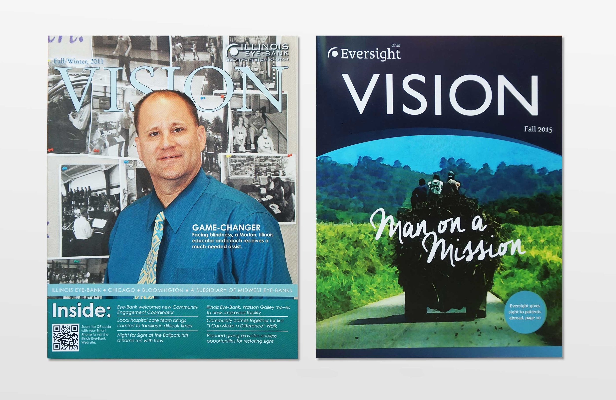
Re-envisioningVision magazine
Goals
Bring new life to Eversight’s tired magazine design
Develop strong brand recognition through consistent style and voice
Better appeal to and educate Eversight’s family-centered volunteer community
Solution
I used our signature arc on the front, updated the typeface, and included our new supporting colors, such as orange to add friendliness.
I used existing photography in a more creative way to add interest.
Vision, before and after (below):


Targeting surgeons
As part of the rebranding effort, I redesigned the surgeon information folder, a crucial piece for our surgeon relations team, who used it to educate medical professionals about Eversight’s services and pricing.
Goals
Create brand recognition among surgeons with a strong, clear message. I developed "Quality. Delivered." as our copy theme, and we carried it and several strategic variations through the project.
Develop more user-friendly order forms and informational sheets.
Solution
I designed a template system where every sheet is labeled at the top, and in the same way, allowing our lab team to mix and match sales sheets within the folder to customize it for each surgeon
The cover sheet’s arc design perfectly aligns with the folder’s for a seamless experience
I illustrated the medical tissue to scale


